Checkpoints
Build a visualization
/ 25
Build a line graph
/ 25
Add a Bar graph of Products by Average Sale Price
/ 25
Add a Bar graph of Users by Total Revenue
/ 25
Build a dashboard using the Looker Enterprise UI
 IMPORTANT:
 Make sure to complete this hands-on lab on a desktop/laptop only.
 There are only 5 attempts permitted per lab.
 As a reminder – it is common to not get every question correct on your first try, and even to need to redo a task; this is part of the learning process.
 Once a lab is started, the timer cannot be paused. After 1 hour and 30 minutes, the lab will end and you’ll need to start again.
 For more information review the Lab technical tips reading.
Activity overview
Enterprise-grade data visualization tools are used by organizations that need to manage and analyze large amounts of data. One popular enterprise-grade tool is Looker.
Looker is a business intelligence (BI) platform that helps you explore, analyze, visualize, and share your data. Looker Enterprise is a part of the Looker platform and is a powerful tool that can be used to visualize data, make better decisions, improve communication, and identify trends.
Looker Enterprise’s semantic layer and highly scalable architecture make it easy for analysts to explore large datasets without having to worry about the complexity of code. This ensures that all users are working from the same source information, eliminating the possibility of conflicting versions. Looker Enterprise's data governance model also empowers users to collaborate on insights while protecting sensitive data.
In this lab, you'll use an Explore in Looker Enterprise to build visualizations that support in-depth data analysis and critical business decision making.
Scenario
To gain insights into sales performance trends and facilitate comparisons with recent months, TheLook eCommerce's VP of Finance, Kiran, has requested an interactive dashboard summarizing sales data for 2022. This dashboard will enable Kiran to easily identify and highlight key performance indicators (KPIs) such as revenue.
You decide to use Looker Enterprise to create a Business Insights dashboard, which is an interactive visualization that is used to better understand KPIs and the performance of a business over time.
Here’s how you'll do this: First, you’ll build a single value visualization and add it to a new dashboard. Next, you’ll add a line graph to display the trend of the total revenue for 2022, by product category, to the new dashboard. Then, you’ll add two more visualizations; a bar chart that displays average sale price by product, and a column chart that displays total revenue by country. Finally, you’ll add a country filter to the dashboard.
Setup
Before you click Start Lab
Read these instructions. Labs are timed and you cannot pause them. The timer, which starts when you click Start Lab, shows how long Google Cloud resources will be made available to you.
This practical lab lets you do the activities yourself in a real cloud environment, not in a simulation or demo environment. It does so by giving you new, temporary credentials that you use to sign in and access Google Cloud for the duration of the lab.
To complete this lab, you need:
-
Access to a standard internet browser (Chrome browser recommended)
-
Time to complete the lab---remember, once you start, you cannot pause a lab
How to start your lab and sign in to Looker
-
Click the Start Lab button. On the left is the Lab Details panel with the following:
- Time remaining
- The Open Looker button
- The temporary credentials that you must use for this lab
- Other information, if needed, to step through this lab
Note: If you need to pay for the lab, a pop-up opens for you to select your payment method. -
Click Open Looker.
Tip: Arrange the tabs in separate windows, side-by-side.
- Copy the Looker username (email) and password below and paste it into the Looker Log in dialog.
Looker username (email):
Looker password:
You can also find the Looker username (email) and password in the Lab Details panel.
- Select the Stay logged in checkbox, and click Log In.
After a successful login, the Looker instance for this lab will display.
Task 1. Build a single value visualization
In this task, you’ll build a single-value visualization showing the total revenue for 2022. First, you’ll determine the total revenue for 2022, and display that number as a single-value visualization. Then, you’ll add this visualization to a new Business Insights dashboard.
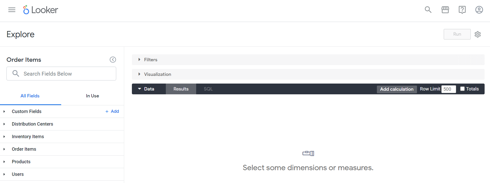
- In the navigation panel, click Explore. The Explore menu displays.
- In the TheLook-GCDA dropdown section, select Order Items.
The Order Items page displays; it automatically opens on the All Fields tab.
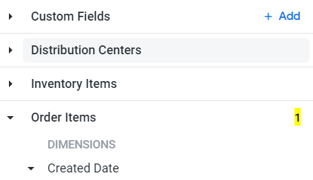
- From the All Fields tab, navigate to Order Items; then select Total Revenue measure in the Measures section.
Notice that the number 1 is added next to the Order Items dropdown header. When you select or deselect a field, the selection count will change to reflect the current number of selected fields. This can be used to verify that you have selected the correct number of fields.
-
Navigate to All Fields tab > Order Items > Dimensions section, and expand the Created Date dropdown menu.
-
Click on the Filter by field (
) icon next to Date. Notice that the number next to the Order Items dropdown header has increased to 2.
-
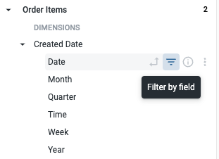
Expand the Filters bar (if it’s not already expanded), then set the dropdown to the is in the year option for the Order Items Created Date.
-
Type 2022 to filter the results for the year 2022.
-
Expand the Visualization bar, and select the Single Value icon
.
-
Click Run. The total revenue for 2022 should display in the Visualization section.
-
In the Explore action bar, click Explore actions (
).
-
From the Explore actions dropdown menu, select Save…> As a new dashboard.
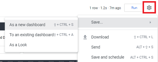
The Save as a new dashboard dialog displays.
- On the Settings tab, in the Title field, enter the following title for the new dashboard: Business Insights.
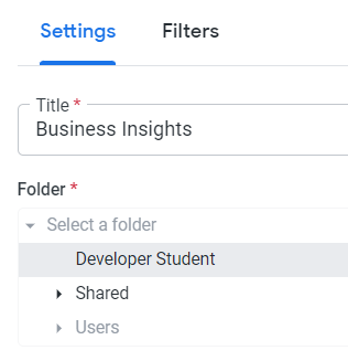
- Click Save.
Click Check my progress to verify that you have completed this task correctly.
Task 2. Build a line graph
In this task, you’ll identify the total revenue by product category for 2022, and display the results as a line graph. Then, you'll add this visualization to the Business Insights dashboard you created in the previous task.
-
In the navigation panel, click the Home button in the Main menu, then select Explore > Order Items to clear the screen of any work done in the previous task.
-
In the TheLook-GCDA section, select Order Items. The Order Items Explore page displays.
-
Navigate to All Fields tab > Order Items > Measures section > Total Revenue. Make sure to verify that this field has been selected by checking the selection count before moving on.
-
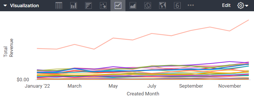
Navigate to All Fields tab > Order Items > Dimensions section > Created Date, and select Month. Be sure to select only the Month field.
-
Navigate to All Fields tab > Products, and then click the Pivot data (
) icon next to the Category dimension.
-
Navigate to All Fields tab > Order Items > Dimensions section > Created Date, and then click the Filter by field (
-
Expand the Filters bar (if it’s not already expanded). For Order Items Created Date, select the is in the year option, enter 2022 to filter the results for 2022.
-
Expand the Visualization bar and select the Line icon.
-
Click Run.
-
In the Explore action bar, click the Explore actions icon (
-
In the Add to a Dashboard in this folder dialog, enter the following title for the visualization: Total Revenue by Product Category.
-
In the navigation panel of the Add to a Dashboard in this folder dialog, select Developer Student.
-
Select Business Insights.
-
Click Save to Dashboard.
Click Check my progress to verify that you have completed this task correctly.
Task 3. Add a bar graph of products by average sale price
In this task, you'll identify the average sale price by product category and display the results as a bar chart. Then, you'll add this visualization to the Business Insights dashboard.
-
In the navigation panel, click the Main Menu (
) icon. The Main Menu opens.
-
In the TheLook-GCDA section, select Order Items. The Order Items Explore page displays.
-
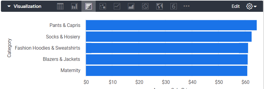
Navigate to All Fields tab > Order Items > Measures section, and select Average Sale Price.
-
Navigate to All Fields tab > Products > Dimensions section, and select Category.
-
Navigate to Order Items > Dimensions section > Created Date, and click the Filter by field (
- Expand the Filters bar (if it’s not already expanded). For Order Items Created Date, select the is in the year option, enter 2022, to filter the results for 2022.
-
Expand the Visualization bar, and select the Bar option.
-
Expand the Data section, and update the row limit to 5.
-
Click Run. A bar graph displays in the Visualization section.
- In the Explore action bar, click the Explore actions (
The Add to a Dashboard in this folder dialog opens.
-
Enter the following title for the visualization: Average Sale Price by Category.
-
In the navigation panel of the Add to a Dashboard in this folder dialog, select Developer Student.
-
Select Business Insights.
-
Click Save to Dashboard.
Click Check my progress to verify that you have completed this task correctly.
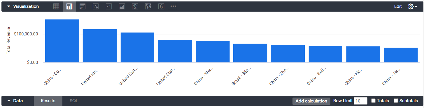
Task 4. Add a bar graph of users by total revenue by country
In this task, you'll identify the total revenue by country and display the results as a column chart. Then, you'll add this visualization to the Business Insights dashboard.
-
In the navigation panel, click the Main Menu (
-
In the TheLook-GCDA section, select Order Items. The Order Items page displays.
-
Navigate to All Fields tab > Order Items > Measures section, and select Total Revenue.
-
Navigate to All Fields tab > Users, and select Country and State.
-
Navigate to All Fields tab > Order Items > Dimensions section > Created Date, and click the Filter by field (
-
Expand the Filters bar (if it’s not already expanded). For Order Items Created Date, select the is in the year option, enter 2022, to filter the results for 2022.
-
Expand the Visualization bar and select the Column option.
-
Expand the Data section, and update the row limit to 10.
-
Click Run.
-
In the Explore action bar, click the Explore actions (
-
Enter the following title for the visualization: Total Revenue by User.
-
In the navigation panel of the Add to a Dashboard in this folder dialog, select Developer Student.
-
Select Business Insights.
-
Click Save to Dashboard.
Click Check my progress to verify that you have completed this task correctly.
Task 5. Add a filter to the dashboard
In this task, you'll add a country filter to the Business Insights dashboard.
-
Click on the Looker logo. The Looker Home page displays.
-
In the navigation panel, navigate to Folders > My folder.
The Developer Student’s folder opens.
- Click on the Business Insights dashboard.
The Business Insights dashboard opens.
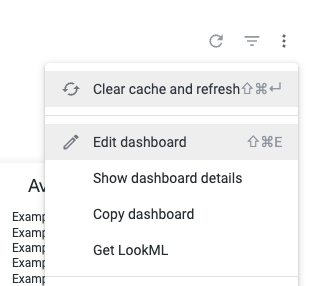
- Click the Dashboard actions menu icon (
), and select Edit dashboard.
The Business Insights dashboard opens.
- Click the Filters button in the toolbar at the top left of the window. In the Filters dropdown menu, select Add Filter.
The Add Filter dialog opens.
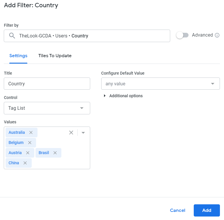
-
In the Filter by field, enter Country. A Users dropdown menu displays.
-
In the Users dropdown menu, select Country. The Add Filter: Country dialog opens.
-
Expand the any value dropdown of Values field.
-
Select the first 5 country names.
-
Click Add.
-
Click Save.
-
On the Business Insights dashboard, expand the Country filter field, and select the 5 countries you added for the filter.
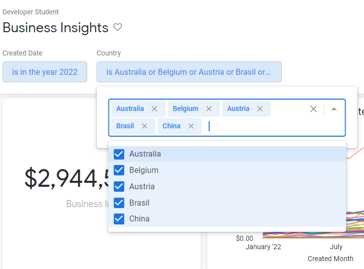
- Click Update. The newly created product country filter has been applied to the visualizations on the dashboard.
Conclusion
Great work!
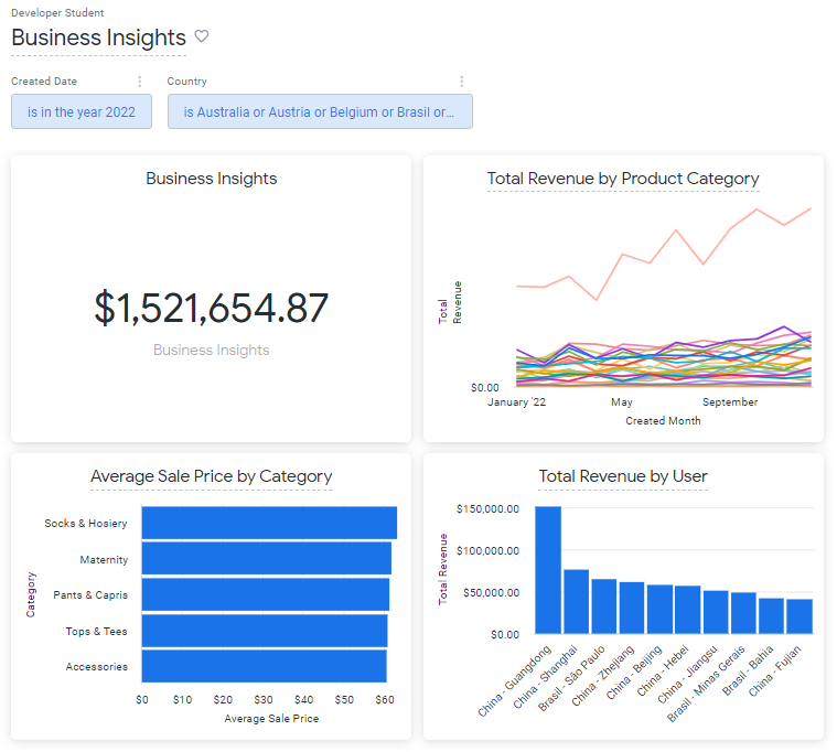
You have created a Business Insights dashboard that can help Kiran track how sales have been doing in recent years and identify trends in the data.
To create the dashboard, you first built a visualization in the Looker Enterprise Explore user interface (UI). This visualization displayed the trend of the total revenue over time, by product category. You then added two more visualizations to the dashboard: a bar chart that displays average sale price by product, and a column chart that displays total revenue by country. Finally, you added a country filter to the dashboard.
Through this lab, you gained practical experience in using the Looker Enterprise UI to create an interactive dashboard. You also developed skills in building visualizations that meet a specific user need and using a filter to help users find the information they are looking for.
You are well on your way to understanding how to create interactive dashboards that meet a business need using the Looker Enterprise UI.
End your lab
Before you end the lab, make sure you’re satisfied that you’ve completed all the tasks. When you're ready, click End Lab and then click Submit.
Ending the lab will remove your access to the lab environment, and you won’t be able to access the work you've completed in it again.
Copyright 2024 Google LLC All rights reserved. Google and the Google logo are trademarks of Google LLC. All other company and product names may be trademarks of the respective companies with which they are associated.